
Within the iconographic community, there is a conviction that is rarely spoken aloud but profoundly shapes the way people think about icons. It goes roughly like this: a true icon should look like a Byzantine or Rublev-school icon. Faithful copying of these historical styles is the only legitimate path, and any search for a new visual language amounts to a departure from tradition.
This conviction has its logic. Centuries-old iconographic styles carry an enormous theological and spiritual weight. They are proven, recognisable, rooted in liturgy. Respect for them is entirely justified. The problem begins where respect turns into dogma and a specific historical style becomes equated with the canon itself. Then tradition, instead of being a living current, becomes a museum exhibit.
The question of whether sacred art can be modern touches something fundamental. It reaches far beyond aesthetics. At its core, it asks where to seek the depth of an icon. In the repetition of one specific visual form? Or rather in something far more essential: in the process, in theology, in the relationship between the icon and the person who contemplates it.

Why the assumption that an icon must look “Byzantine”?
When style becomes dogma
Iconography has produced several recognisable styles. Each had its own historical, theological and cultural context. The Byzantine style, the Rublev school, the Coptic school, Ethiopian, Ukrainian. Each expressed the same theological truth in a different visual language, adapted to the sensibility of its era and culture.
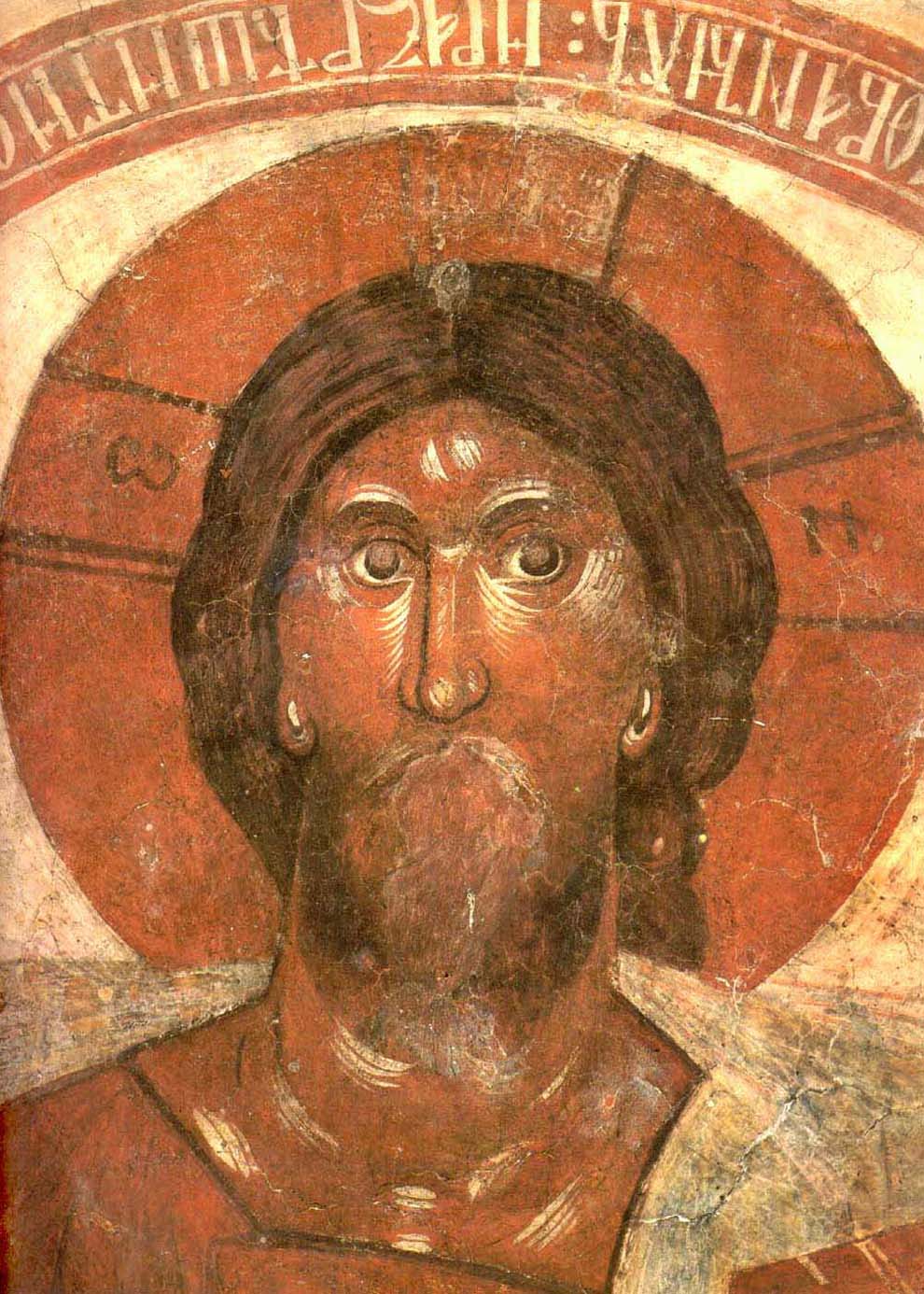
Over time, however, certain styles, especially the Byzantine and Rublev traditions, came to be treated not as one of many possible forms of expression but as the only permissible one. A contemporary iconographer may understand icon theology, maintain the symbolic canon and work with traditional techniques. Yet if they seek their own artistic interpretation, they sometimes face the accusation that “this is not a real icon.” This accusation rarely concerns theological content. It concerns the fact that the artist did not faithfully copy a specific historical style.
This closure is emotionally understandable but historically difficult to defend. The icon never had one “correct” appearance. The iconographic canon concerns theological content, symbolic proportions, the relationship between figures and the meaning of gestures. It does not impose one painting style as binding for all time.
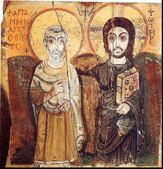
Coptic icon, "Christ and St. Menas", 6th c.
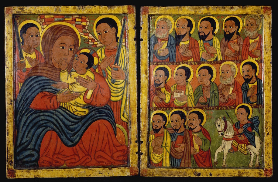
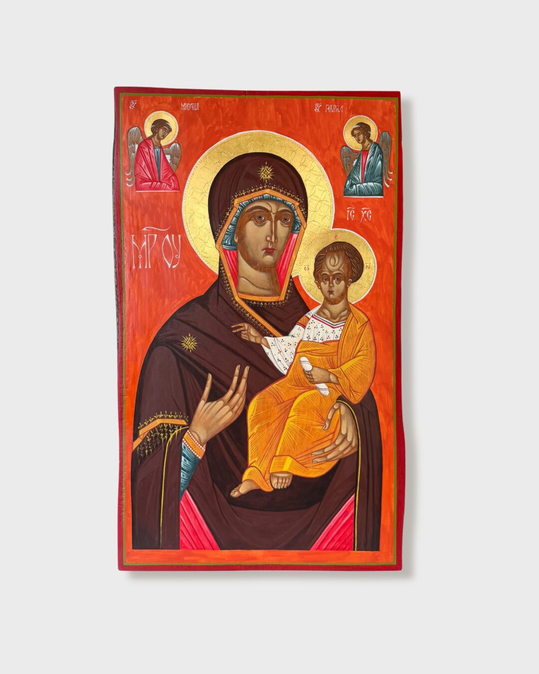
Ethiopian icon, "Diptych with Mary and Child", 15th c.
What is canon, and what is style?
This distinction is crucial and worth making precisely. The iconographic canon is a set of theological principles expressed in visual form. It determines how to depict Christ, the Mother of God and the saints. It indicates which proportions and gestures carry dogmatic significance and which colour symbolism conveys the content of faith. The canon protects the icon from becoming an arbitrary illustration detached from liturgical tradition.
Style, on the other hand, is the way in which a particular era, culture and artist realise these principles visually. The Byzantine, Rublev, Coptic and Baroque styles are different answers to the same theological question. None of these styles is “more canonical” than the others. They are equally legitimate, as long as they remain faithful to the content they express.
One further observation is worth making here. For centuries, iconographers worked with mineral pigments of extraordinary purity and intensity. Lapis lazuli, cinnabar, malachite, gold. These were noble, vivid colours, full of inner light. The iconographic palette was never inherently dark or muted. We associate it with a darkened tonality because over the centuries varnish darkened, altering the colour perception of the works. Icon painting has, however, always been a practice of pure, intense colour. What we take to be the “only proper appearance” of an icon is therefore partly a historical illusion.
The Second Council of Nicaea in the eighth century defended the very cult of images against iconoclasm and affirmed that sacred images are a legitimate form of expressing faith. It did not “establish a style” as binding for all time. The canon developed over subsequent centuries in liturgical and monastic practice, always alive, always open to new visual interpretations, provided they remained faithful to their spiritual and theological core.
The history of sacred painting as evidence of a living tradition
If iconography truly required freezing in one style, we would not know the diversity of forms that emerged over the centuries within the same theological canon.
A few key moments in the history of sacred painting are enough to see this pattern at work. Giotto di Bondone, at the turn of the thirteenth and fourteenth centuries, gave sacred painting a new direction by introducing three-dimensionality, human emotion and naturalism of gesture. His frescoes in the Scrovegni Chapel in Padua opened a path that subsequent generations of painters would follow.
Almost at the same time, within the Byzantine tradition itself, Theophanes the Greek was painting frescoes in the Church of the Transfiguration in Novgorod in a manner previously unseen. Dynamic, expressive brushstrokes, a limited palette, an extraordinary spiritual intensity linked to the theology of Hesychasm. His style defies straightforward classification. Scholars have linked it to various schools, but none fully accounts for the individuality of his painting. And yet Theophanes later worked alongside Andrei Rublev, whose icons are synonymous with harmony and tranquillity. Two masters, the same theological tradition, two entirely different visual languages.
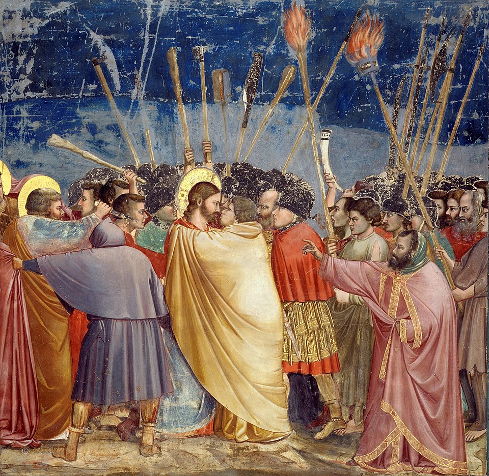
Giotto, "The Kiss of Judas", 14th c.
Theophanes the Greek, "Pantocrator", fresco fragment, 14th c.
El Greco, born in Crete and trained in the post-Byzantine iconographic tradition, painted icons in his youth before creating in Spain one of the most original languages of the sacred in art history. His elongated figures, non-naturalistic colours and expressive deformation of form were so controversial in his time that for centuries he was considered an eccentric. Only the twentieth century recognised that his visionary approach did not weaken spiritual intensity but amplified it.
In the seventeenth century, in what is now Ukraine and Belarus, a transformation of its own was taking place. The Baroque style, arriving from the West, was gradually displacing the established Byzantine style in icon painting. Not only the form was changing, but the medium itself. The underpainting was still executed in tempera, but subsequent layers were increasingly applied in oil paints, yielding an entirely different depth of colour and capacity for modelling. Figures gained greater realism, spatial depth, dramatic chiaroscuro. For adherents of the austere Byzantine tradition, this was an unacceptable change. And yet Baroque icons became over time an integral part of the tradition and a valued chapter in the history of Eastern iconography.
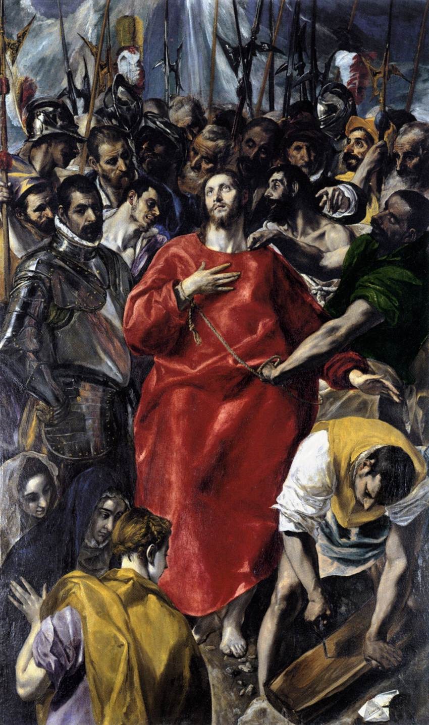
El Greco, "The Disrobing of Christ", 16th c.
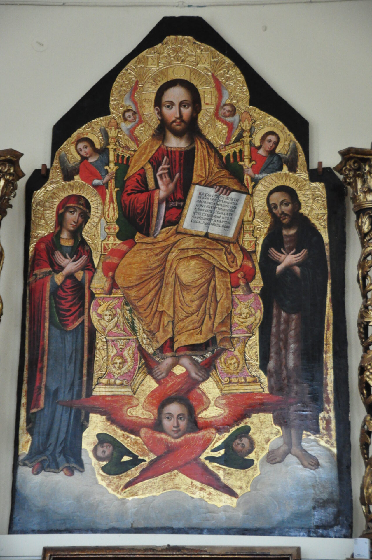
Ivan Rutkovych, "Pantocrator", iconostasis fragment, 17th c.
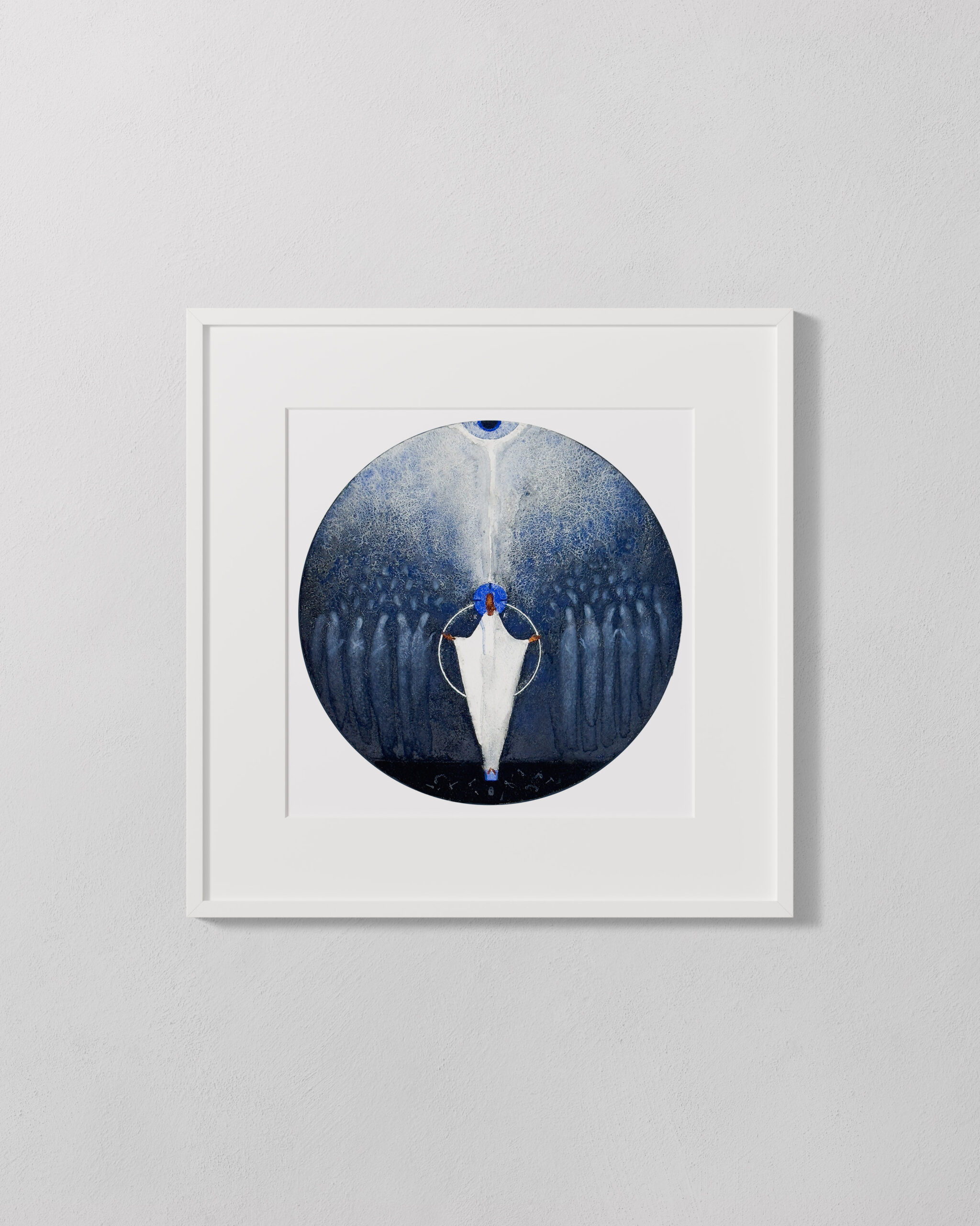
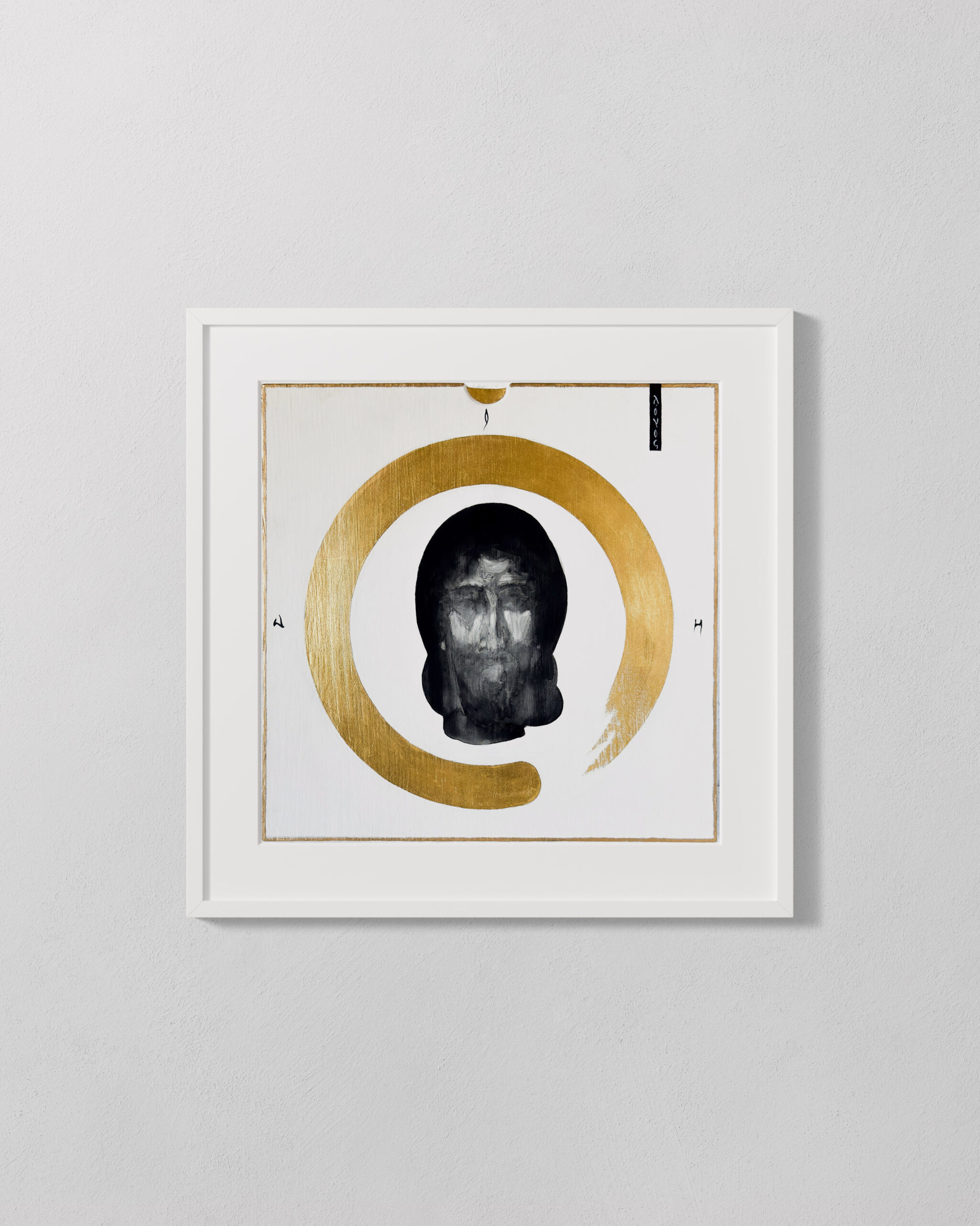
In the twentieth century, Jerzy Nowosielski demonstrated that an icon could speak in the language of geometrisation and reduction of form without losing theological depth. He painted icons, understood their theology from within and simultaneously created in a way that did not copy the past but continued the living current of iconography. He himself said that “the icon is not a closed matter; the icon is an open matter, full of risk.” This statement captures the heart of the problem. Faithful copying of a style eliminates risk, but it also eliminates life.
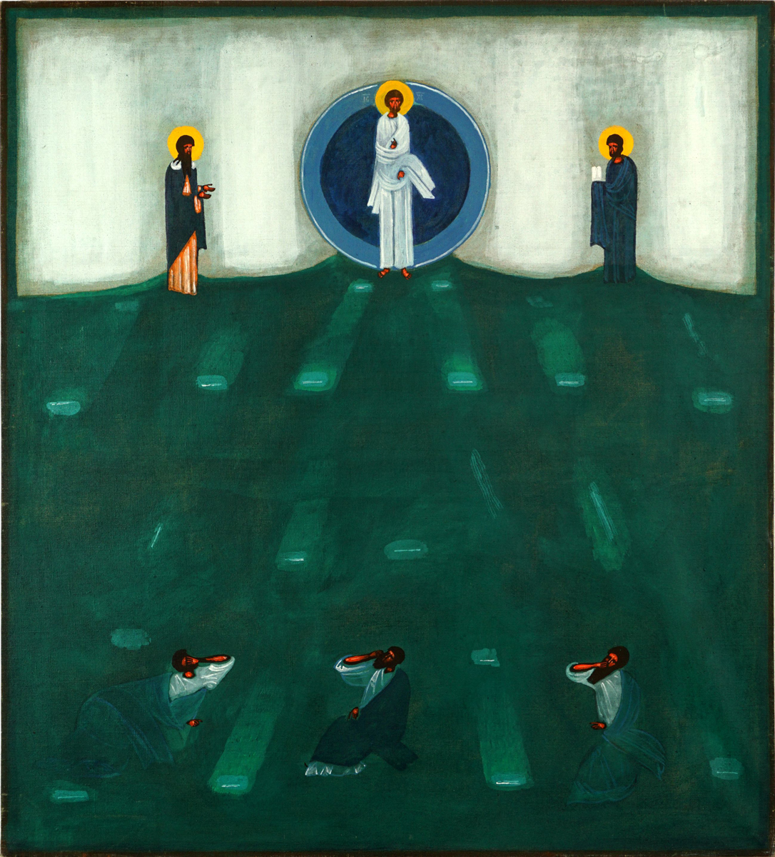
J. Nowosielski, "The Transfiguration"
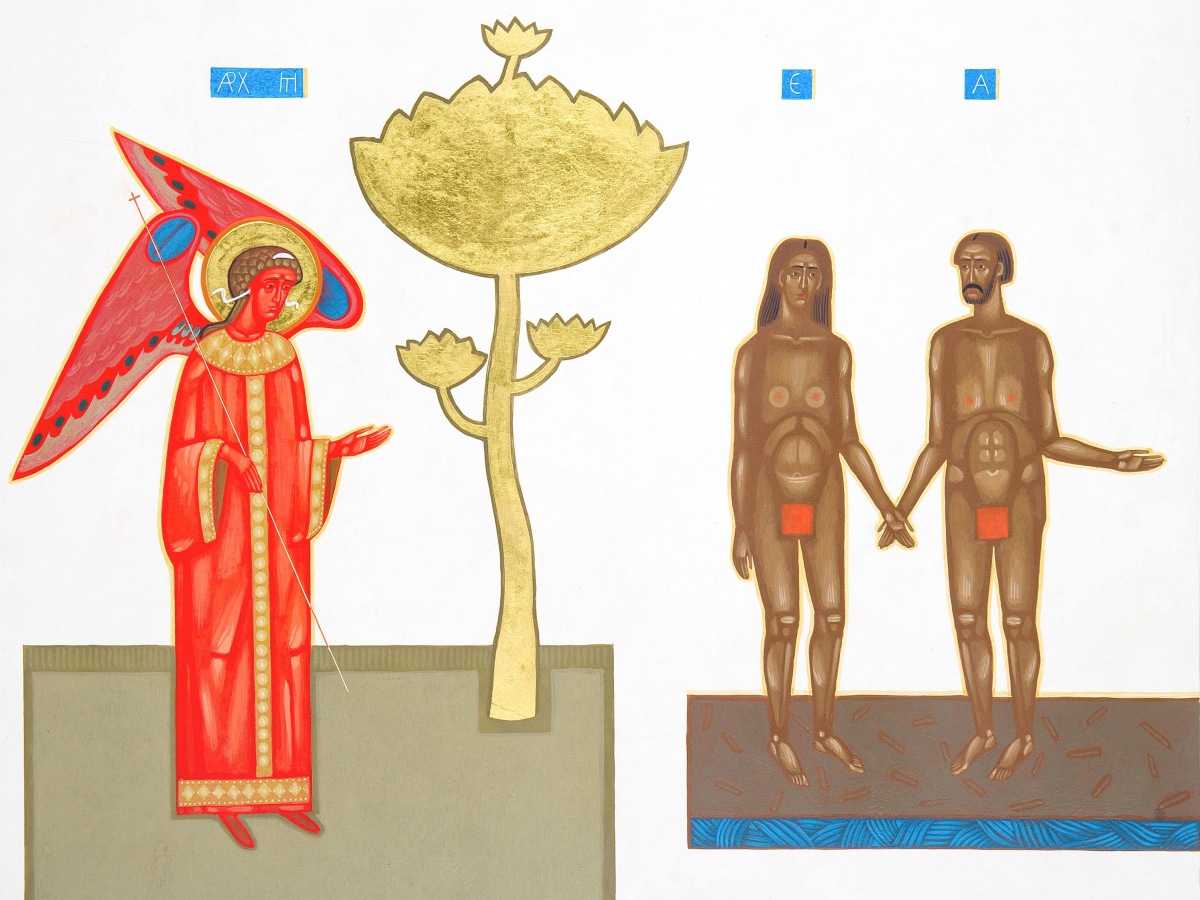
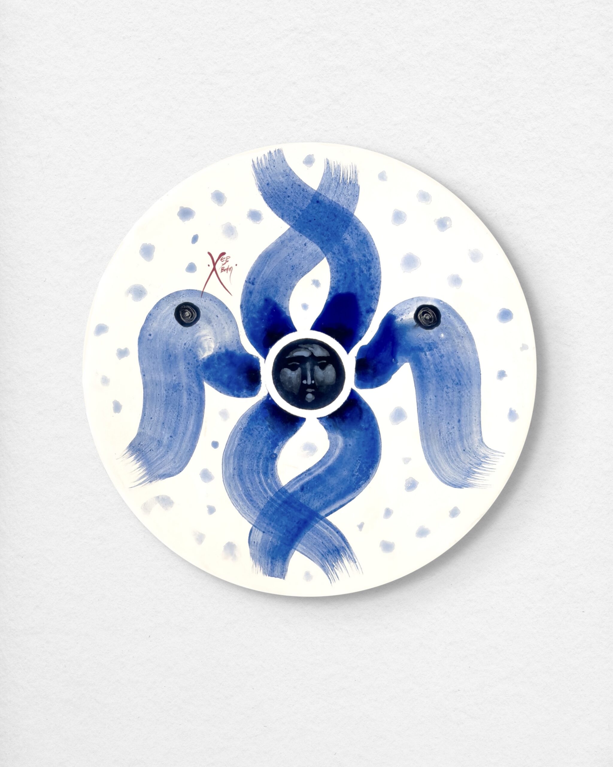
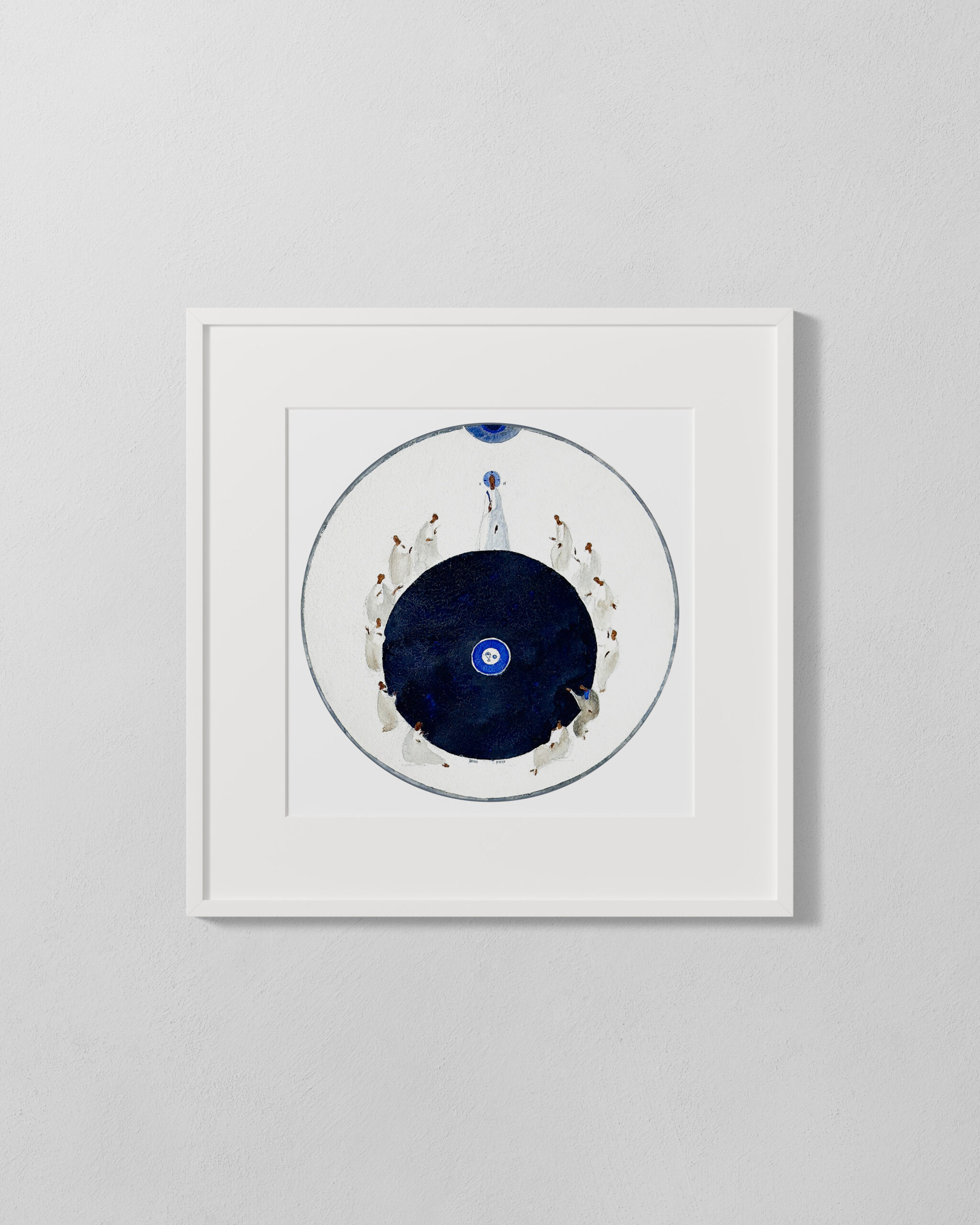
D. Movchan, "The Expulsion from Paradise"
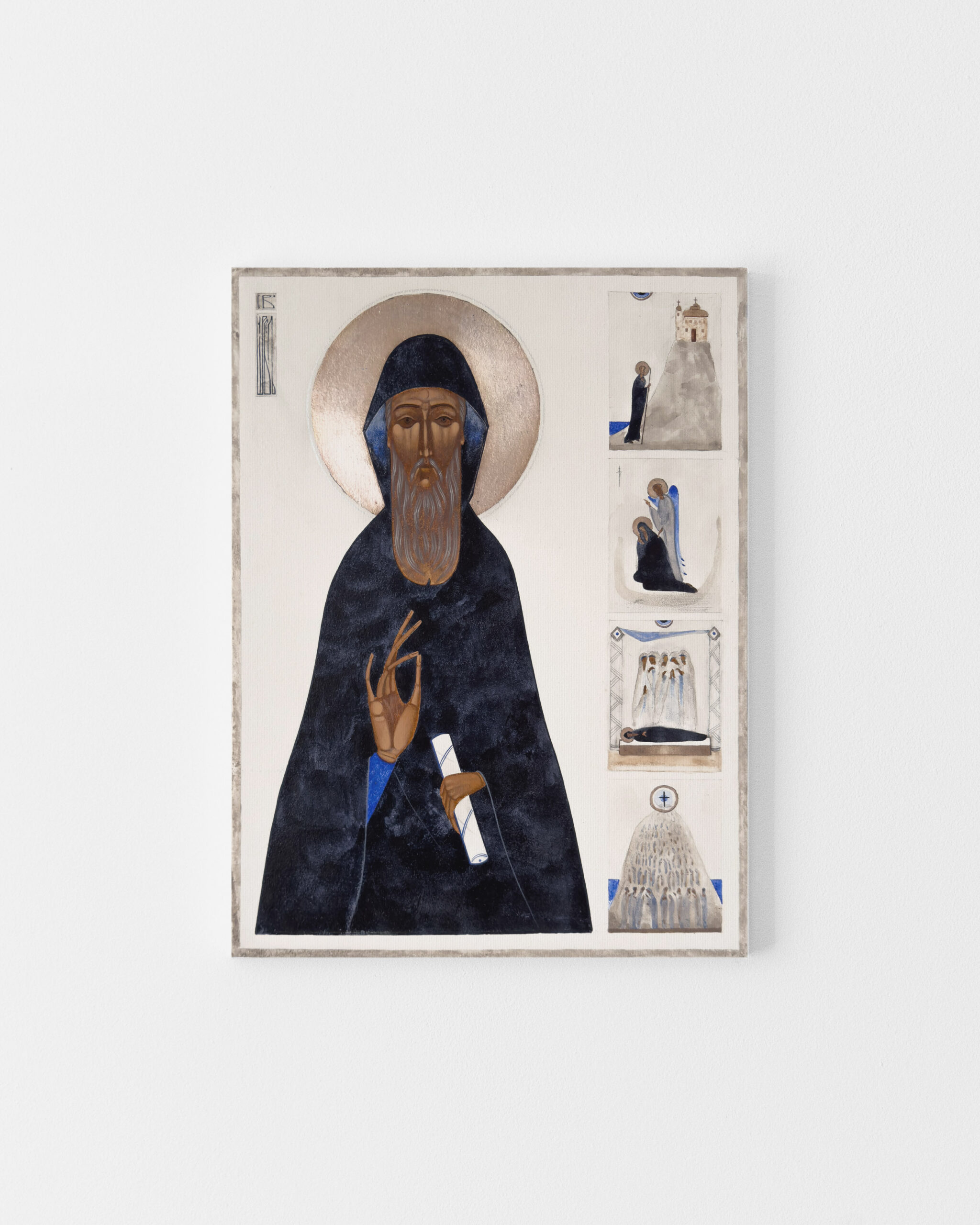
In parallel, in Ukraine, around the Lviv National Academy of Arts and its Department of Sacred Art, a community was taking shape that is today one of the most important centres of contemporary iconography in the world. Artists such as Danylo Movchan, Lyuba Yatskiv and Ivanka Demchuk create icons that preserve the theological canon but speak in the visual language of our time. This community demonstrates that the tradition of the Ukrainian icon is not only alive but continues to evolve.
The answer that history gives is unequivocal. Sacred art has always changed formally, and its vitality lay precisely in the fact that successive generations of artists sought a new language for an unchanging truth. A tradition that does not admit new forms of expression does not protect the icon. It closes it off.
What truly makes art sacred? Style or intention?
The icon as theology in colour, regardless of era
Eastern theology has always called the icon “theology in colour.” This phrase carries a profound truth. The icon goes beyond illustration. It is a message. It does not decorate a wall; it opens a space for contemplation. Its purpose is not to captivate the viewer with form but to enable an encounter with what the icon makes present.
And here we arrive at a crucial distinction. The depth of an icon does not derive from a particular painting style, from the thickness of a panel or from the degree of fidelity to one historical model. It grows from the intention with which it was created. From the theological truth it expresses. From the relationship it builds with the person who contemplates it. The icon is a gateway to silence. Every gateway may take a different form. What matters is what it opens onto.
A contemporary icon that preserves this theological foundation, symbolic proportions, meaningful chromaticism, the relationship between figures, is equally “true” spiritually as an icon from five hundred years ago. The form of expression is different. The content remains the same.
The creative process as a spiritual act
There is one more layer that is rarely discussed in the context of the “modernity” of the icon, yet for me as an iconographer it is the most important. It is the layer of process.
Icon painting in the iconographic tradition is a contemplative act. The iconographer does not produce a “picture.” They participate in a spiritual process with its own internal structure. From preparing the panel and the gesso ground, through gilding, applying successive layers of egg tempera, to the final coat of varnish. Each stage demands focus, patience, presence. And it is precisely this presence that lies at the heart of the entire process.
I remember when I understood that the depth of an icon does not appear at the moment when the painting is finished. It begins much earlier, in the quiet of preparing the ground, in the rhythm of applying successive layers of pigment, in the concentration that accompanies gilding. This experience changed my understanding of authenticity in sacred art. It turned out to be a matter not of style but of presence, of the awareness with which the artist enters the process of creation.
This process does not change because the icon has a contemporary visual interpretation. An artist who creates contemporary icons using traditional techniques performs the same spiritual work regardless of the final visual effect. Regardless of whether they follow the Rublev style or seek their own form. This is the heart of authenticity. Not copying a style, but continuing the process.
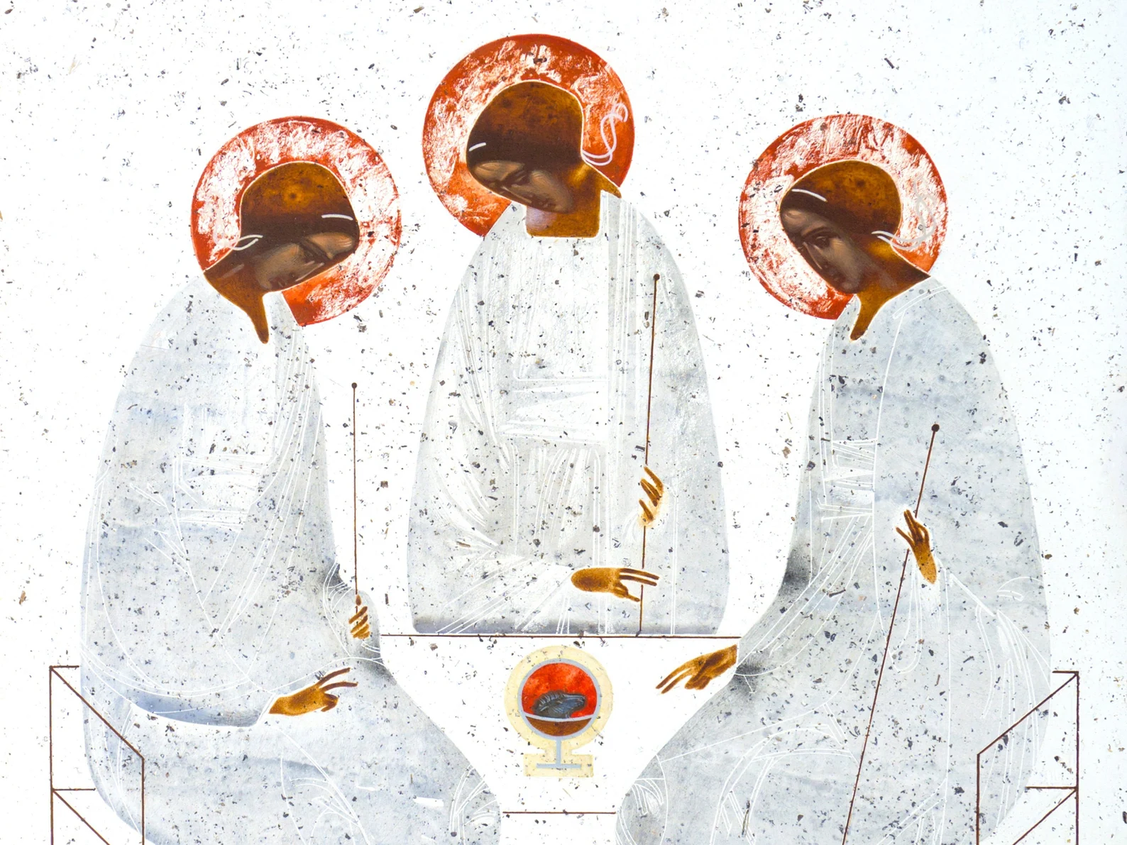
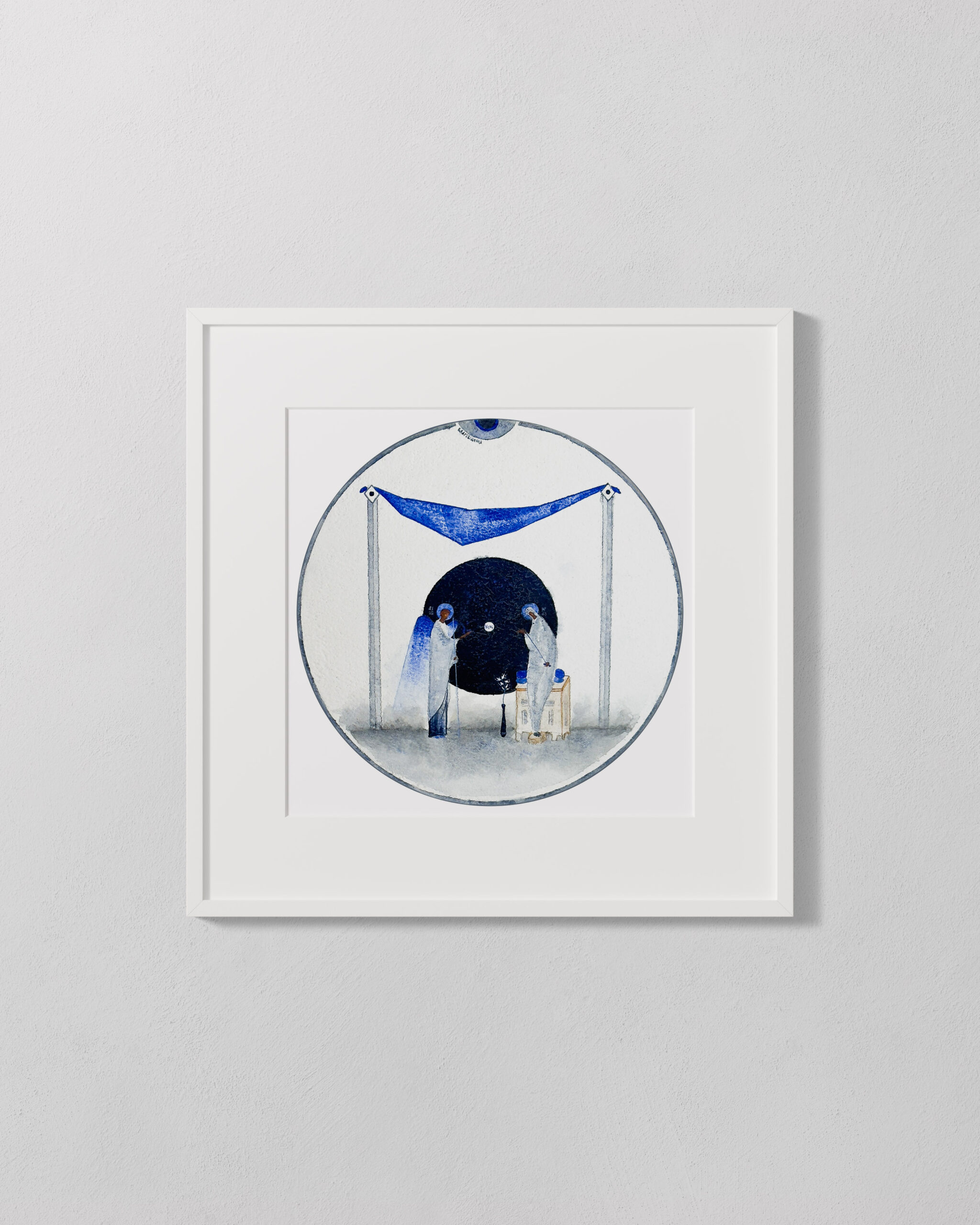
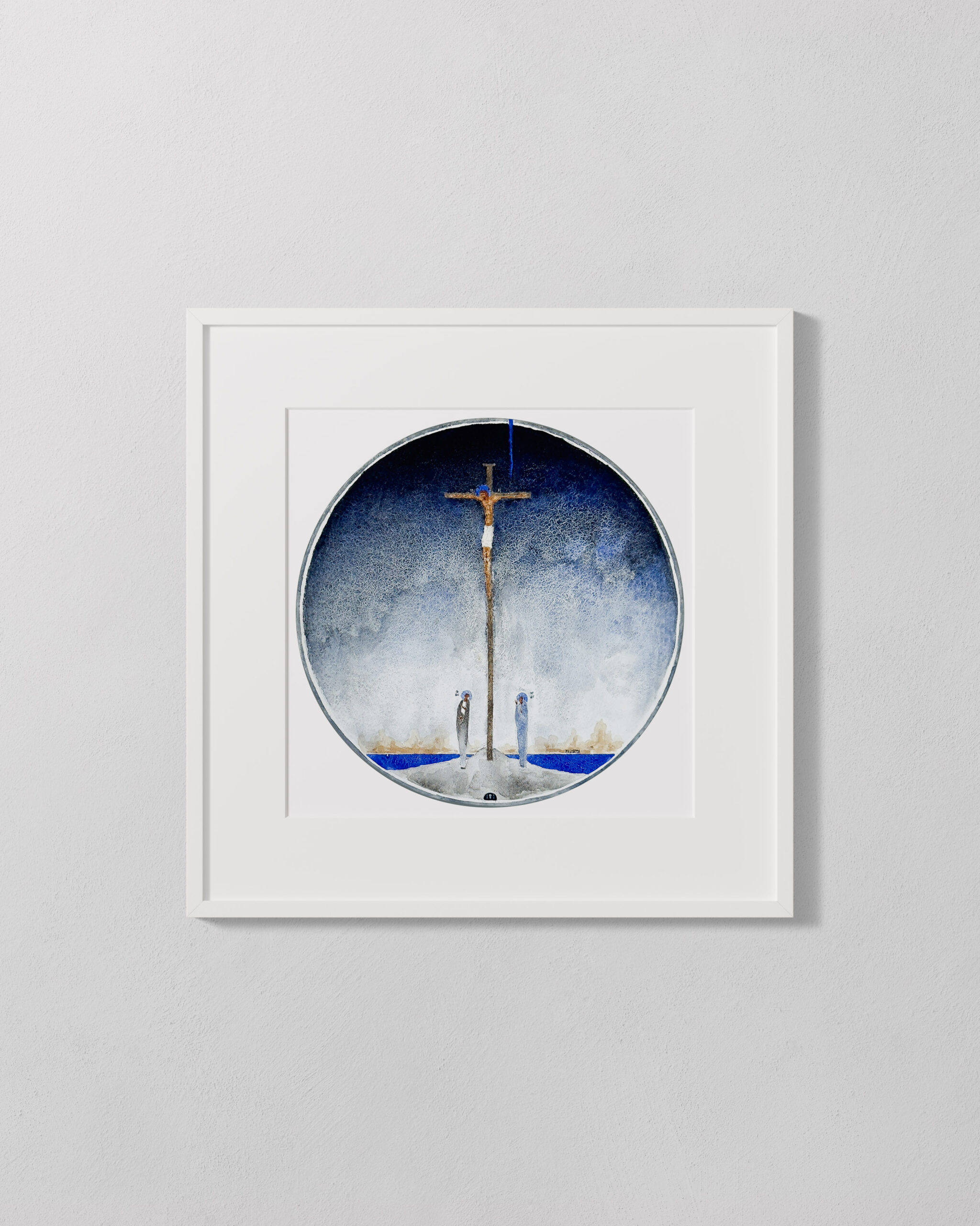
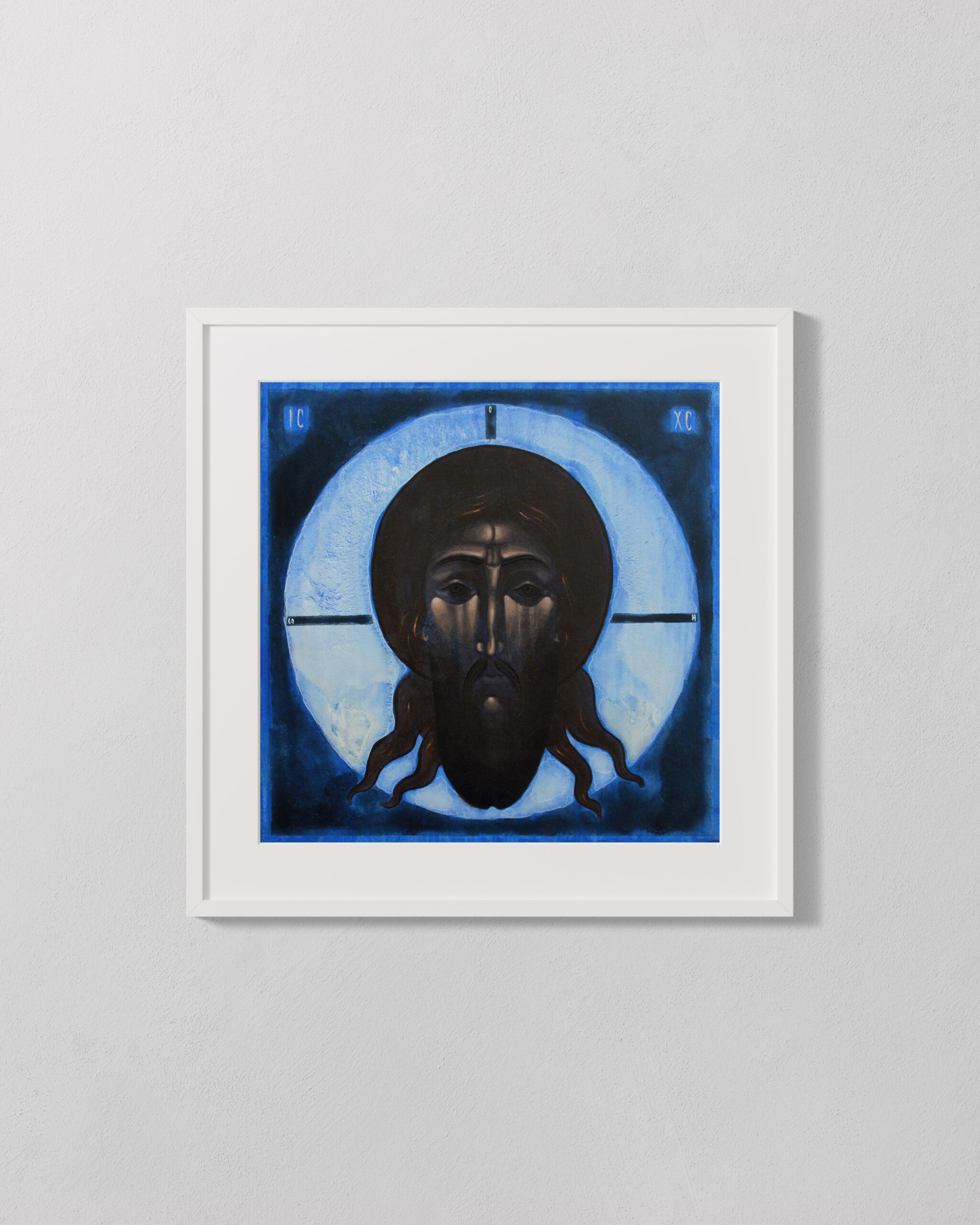
I. Demchuk, "The Holy Trinity"
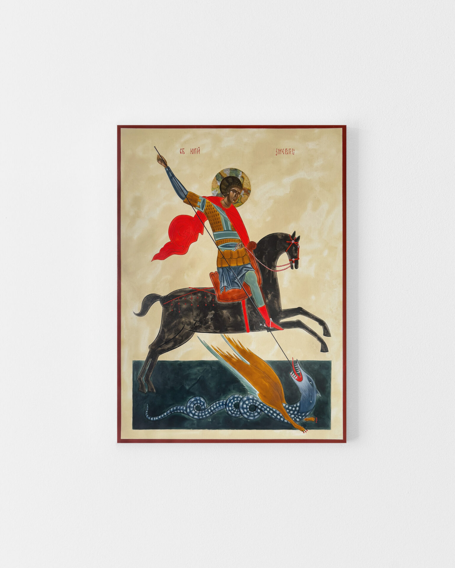
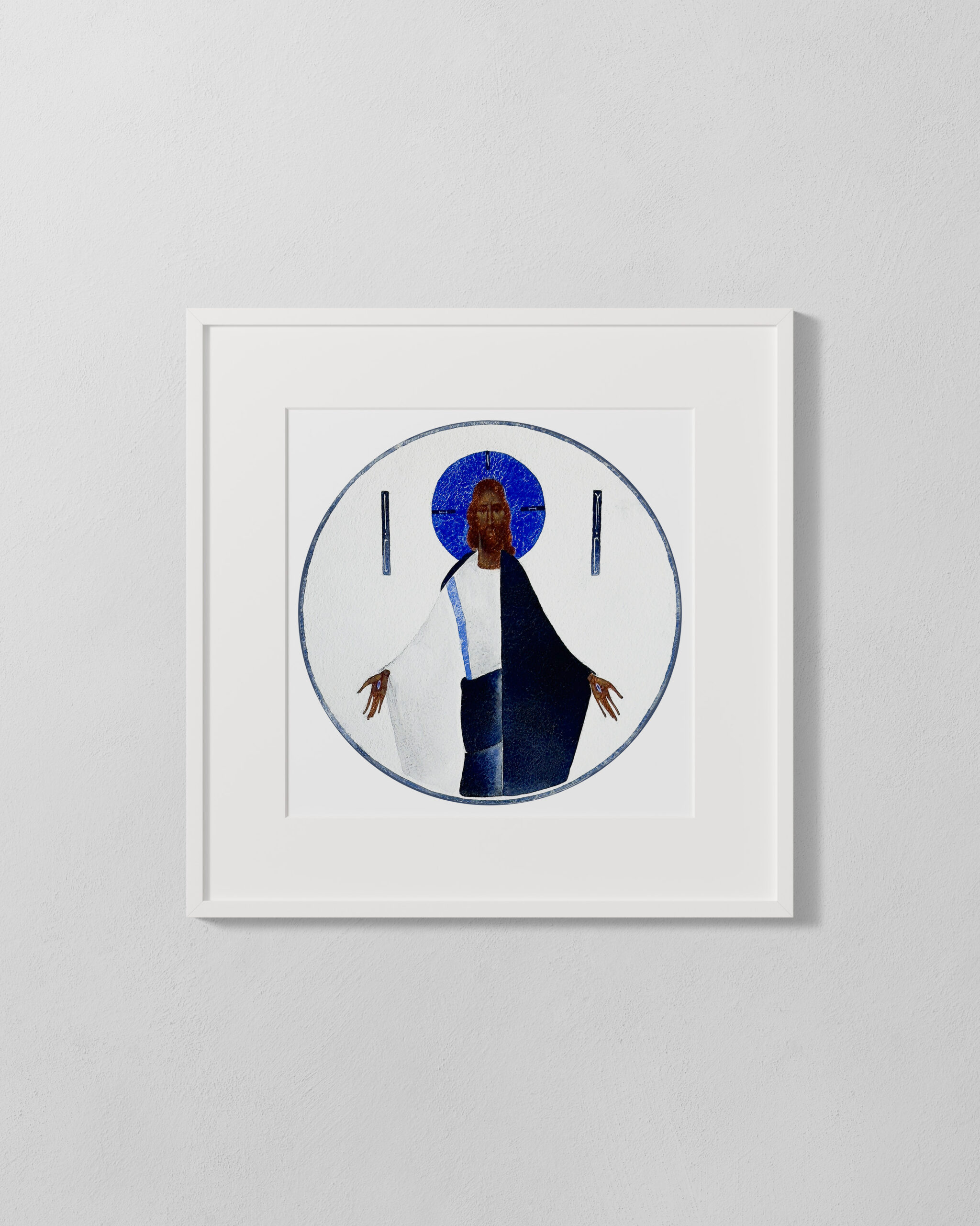
L. Yatskiv, "King of Glory"
How does the contemporary icon preserve the depth of tradition?
Workshop knowledge and conscious choice
One of the most tangible ways in which the contemporary icon remains rooted in centuries-old iconographic practice is the workshop knowledge behind every decision the artist makes. The choice of support, painting medium, gilding method or surface finish stems from an understanding of materials and their behaviour over time. For centuries, iconographers selected wood, ground preparation and pigments according to the location, climate and intended purpose of the work. This flexibility was part of the tradition, not a departure from it.
Contemporary iconography upholds the same principle. An artist may work with egg tempera or with acrylic. They may gild with gold leaf, or with silver or copper, or forgo gilding entirely. They may paint on lime wood, or on a cedar panel, or on an MDF board if conditions require it. What matters is that each of these choices is conscious and justified, not arbitrary.
There is, however, one requirement that unites all eras and all workshops. An icon should be made in a way that ensures its durability. The durability of materials in the iconographic tradition carries a theological dimension. It expresses faith in the permanence of what the icon makes present. For this reason, knowledge of materials, their ageing and their interactions is as important for an iconographer as the ability to draw or compose.
The iconographic canon and artistic freedom. Where is the boundary?
This is one of the most difficult questions in the world of contemporary iconography. The canon grew from a centuries-old tradition of the Church and protects something that extends beyond the image itself. The proportions of figures, the arrangement of hands, the relationship between Mother and Child are not arbitrary rules but a visual form of an encounter with the sacred that successive generations recognised as true. Dogmas are not modified at will, because they are not intellectual constructions. They are an attempt to capture in words and forms that which by its nature transcends words and forms. The iconographic canon plays a similar role. It protects the experience that the icon is meant to convey.
Style, on the other hand, is a space of freedom. The contemporary iconographer faces a challenge that requires both humility and courage. Humility, because one cannot arbitrarily alter what carries theological truth. Courage, because freezing form at one historical moment would amount to claiming that the Holy Spirit ceased to inspire artists after the fifteenth century.
The boundary runs where personal artistic interpretation ends and a change in theological meaning begins. A contemporary icon may seek its own colour palette, employ a different compositional rhythm, simplify or elaborate form. Yet it preserves the symbolic structure that makes it an icon rather than a “religious painting.” This distinction is essential and worth understanding before making a purchase.
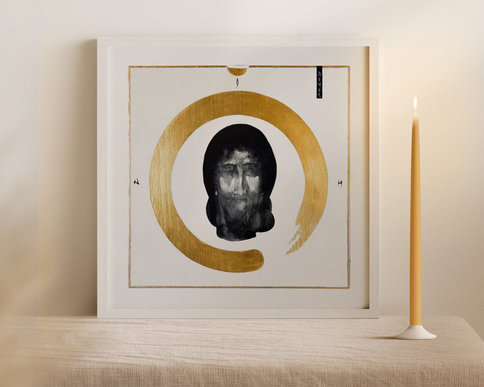
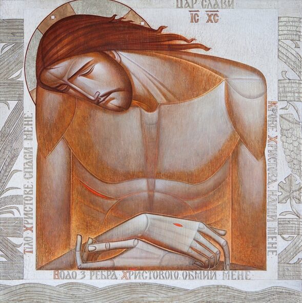
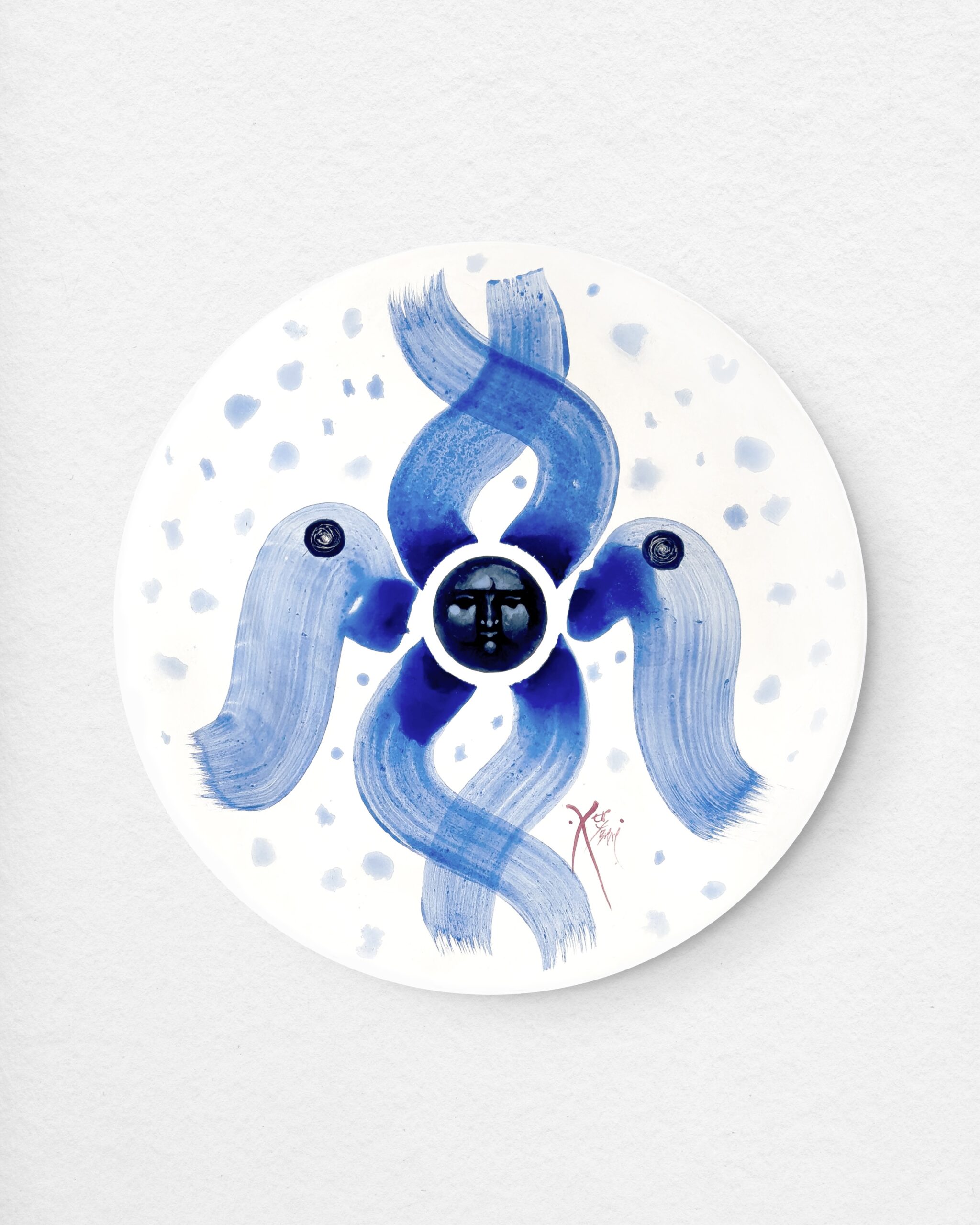
A. Kilyk, "Acheiropoietos"
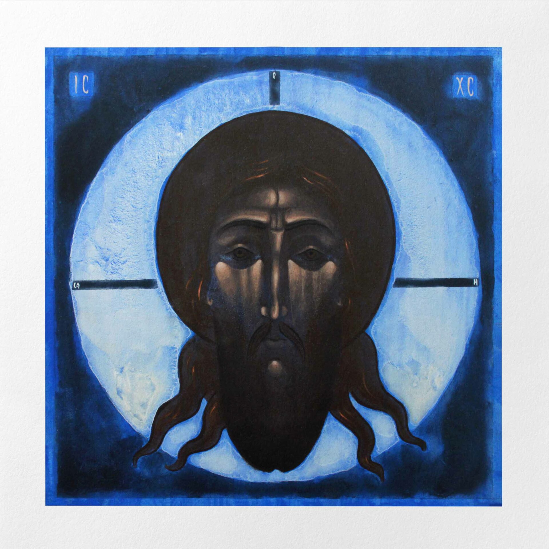
A. Kilyk, "The Nativity"
The sacred in the language of our time
We return to the question with which we began. Can sacred art be modern without losing its depth?
A contemporary hand-painted icon, grounded in proven techniques but seeking its own visual language, continues the same current in the language of a different era. It is enough to compare the expressiveness of Theophanes the Greek with the serenity of Rublev to see how much can coexist within a single tradition. The Baroque icon continued Byzantine heritage by other means. The Lviv school of contemporary iconography does the same with the Ukrainian icon tradition. Form changes; depth remains.
What is most essential in the icon cannot be contained in any one painting style. It grows from the intention of the artist and from the contemplative process of creation. From the theological truth expressed in colour and form. And from the readiness of the viewer to open themselves to that truth.
Sacred art that unites contemporary form with spiritual content exists and continues to develop. Modernity and the sacred have never been opposites. The finest works of sacred art have always united the two, expressing in the beauty of form a truth that transcends it.
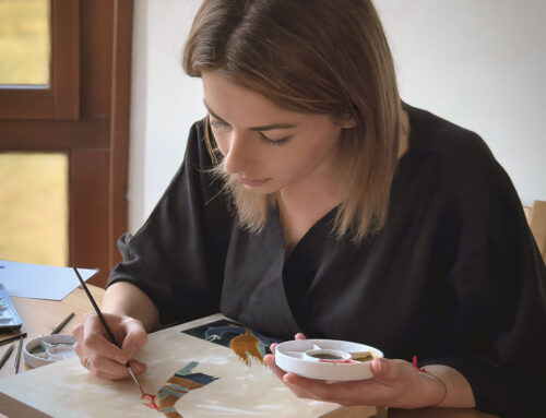
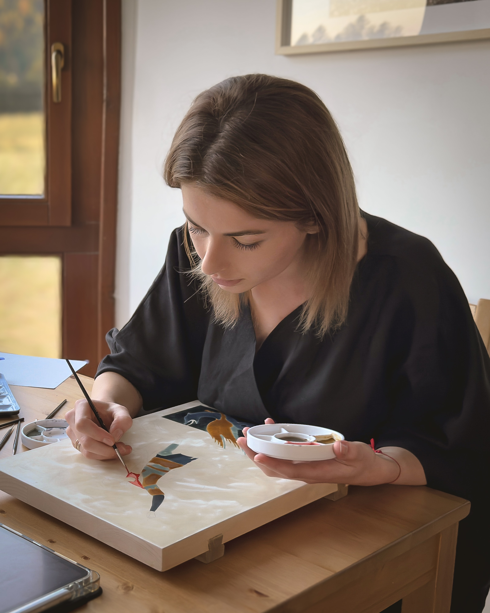
In my studio, every icon is created by hand, through the process I describe in this article. If this subject resonates with you, I invite you to view my collection.

Leave A Comment