

The question comes up regularly. Minimalist spaces, light walls, simple furniture. Is there room in such a context for a sacred work with centuries of tradition?
.
.
The answer is yes. But it requires understanding what an icon truly is.
First, it’s worth separating two issues. An icon is not decoration. It brings authenticity, depth, a sacred dimension. This layer is not subject to aesthetic matching criteria. At the same time, the form of the icon, its color palette, and style of execution can be consciously selected to suit the space. Iconography as an art form lives and evolves with us.
.
.
Where does the fear of stylistic dissonance come from?
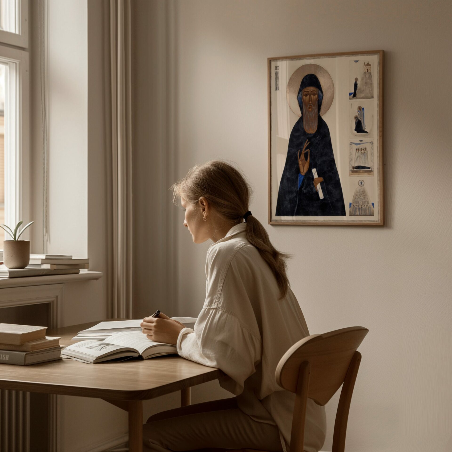
In popular imagination, the icon belongs to traditional interiors. To wooden cottages in the Bieszczady Mountains, Orthodox churches, spaces saturated with history and objects passed down through generations. The contemporary apartment is associated with something entirely different. Light interiors, spare in form and color, where order and functionality dominate.
Yet the icon in its classical form is a minimalist work. Byzantine tradition means economy of form, geometric composition, restrained palette, absence of unnecessary details. Art reduced to essence.
Today’s minimalism seeks exactly the same thing.
.
.
Timelessness and passing trends
Trends in interior design come and go. A few years ago, light Scandinavian interiors dominated, then warm earth tones and natural materials appeared, now we observe a fascination with quiet luxury and japandi.
The icon is not subject to these cycles.
This doesn’t mean it fits every interior. Some icons will compose better with contemporary space, others won’t. But its selection should not be based solely on trend. An icon is an investment in value arising from message, artistic quality, symbolic depth. It’s a work that can survive generations, maintaining its meaning regardless of changes in interior design fashion.
Authenticity in a world of mass production
Most objects in our homes are produced in factories focused on profit, not quality. Mass-produced, in haste, without concern for durability. Even those styled as handcraft are often merely imitations of genuine artistic work.
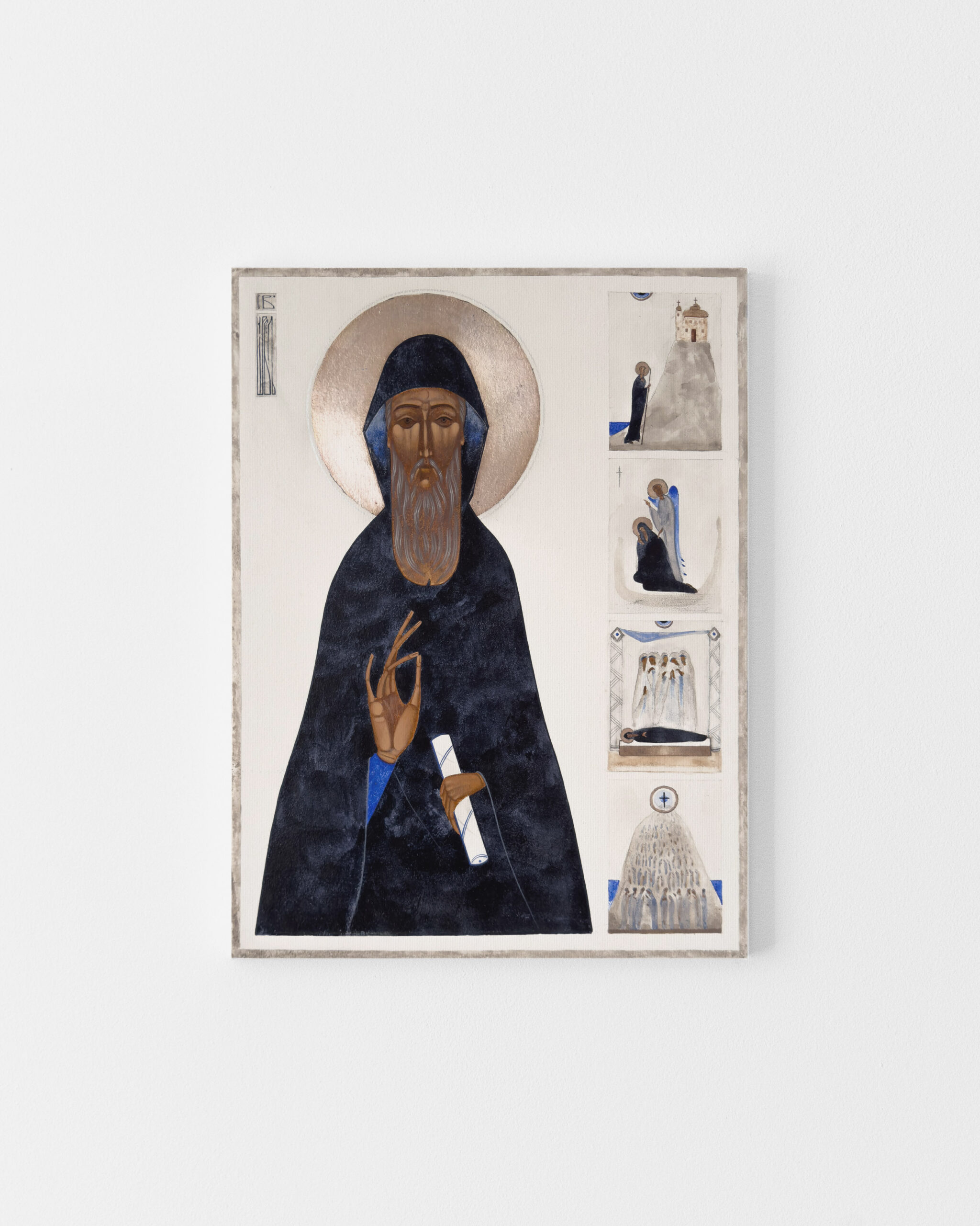
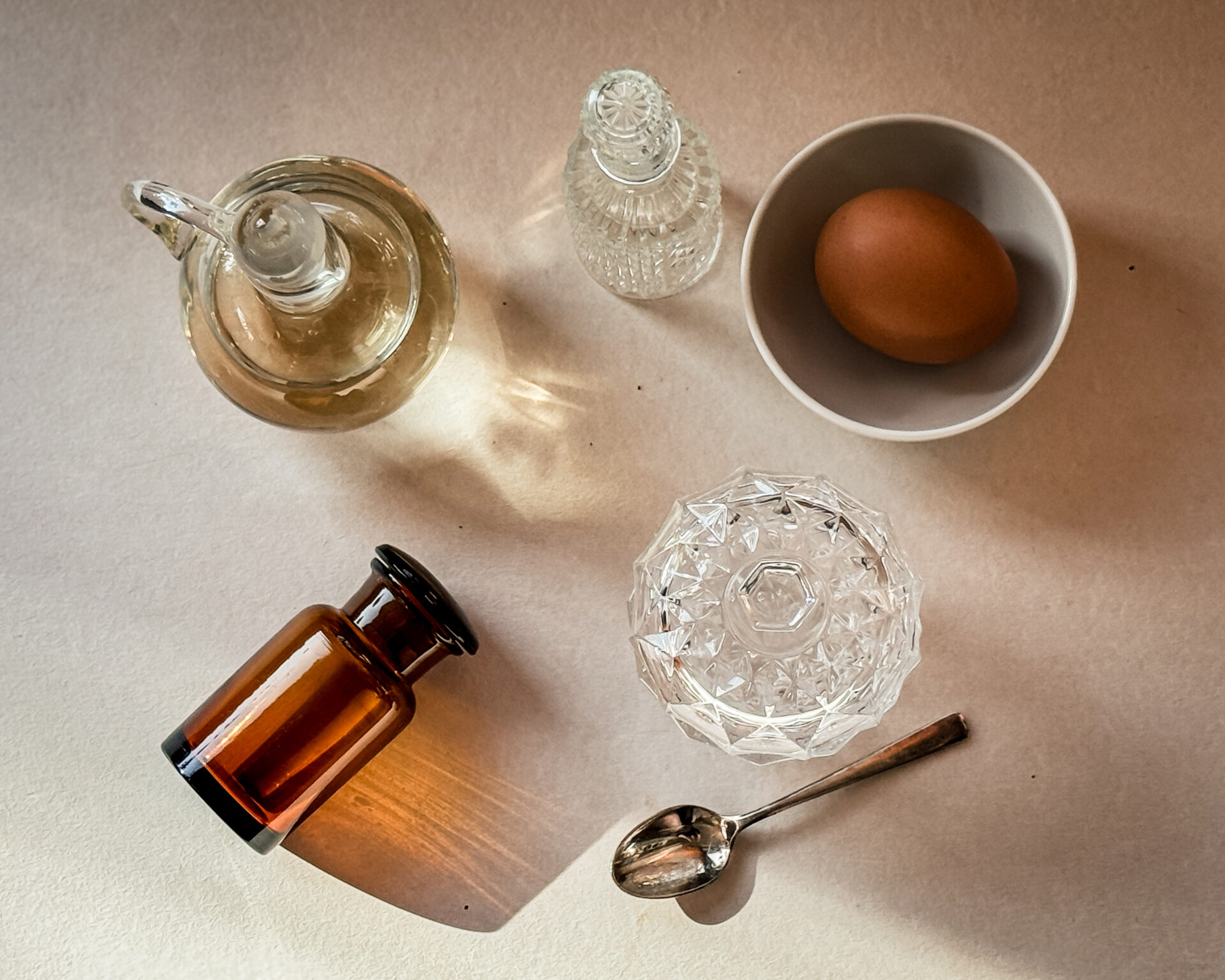
An icon is created differently. Its creation is a process requiring time. Preparing the board, applying gesso, multiple layers of egg tempera, gilding. Work on a single icon can take weeks, sometimes months. This process guarantees the work’s durability for decades, often generations. An icon is not a product. It is created according to principles of artistic craftsmanship developed over centuries.
In a modern interior, which can easily become impersonal, an icon brings authenticity. It shows that someone lives here who chooses things with real value.
.
.
Historical and contemplative value
Creating a contemporary icon based on an ancient original requires understanding the intention of the ancient master, the theology expressed in color and composition. Such an icon brings to the space something more than beauty. It connects reality with hundreds of years of history, with questions about meaning and transcendence that people have asked through the ages.
For some, the contemplative dimension matters. For others, artistic and historical value. Both perspectives are equally important. An icon can serve as a space of silence or as a work that simply moves us. One doesn’t need to be a believer to appreciate its depth.
Egg tempera, glazing, gilding are processes requiring years of study and practice. Purchasing an icon is an investment in authentic art painted by hand, not a poster or print on canvas. Contemporary icons combine traditional technique with minimalist aesthetics characteristic of today’s visual sensibility.
.
.
How to choose an icon for a modern interior?
Not all icons will look good in a minimalist space. But this doesn’t mean abandoning tradition for the sake of style. It’s about conscious choice.
Minimalism and tradition – what connects them?
Modern interiors are designed around simplicity, space, and light. The traditional icon uses the same compositional principles. It is characterized by reverse perspective, geometric arrangement, and harmony of colors. It works on the principle of reduction to essence, which corresponds to contemporary thinking about form.
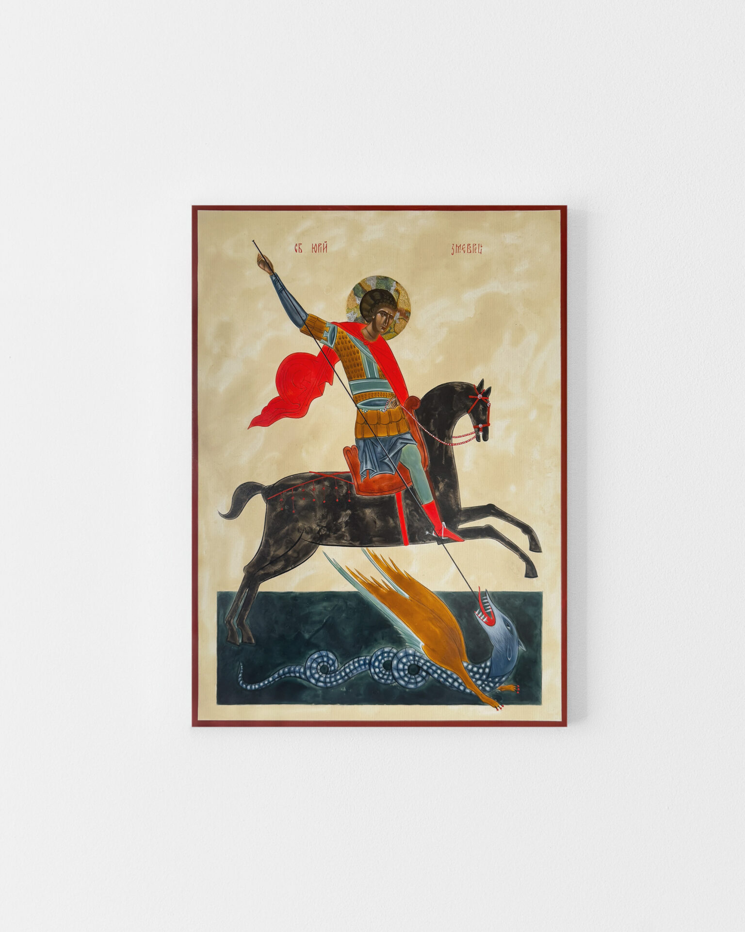
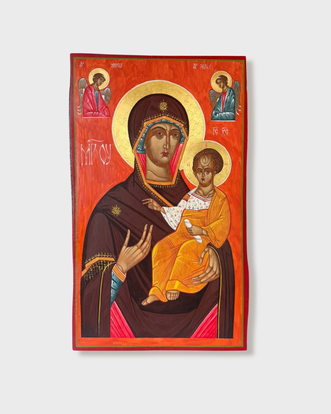
In a minimalist interior, icons with simple composition work best. Instead of works full of ornaments and narrative scenes, it’s worth choosing a single figure, frontal, with a calm background. Icons such as the Pantocrator, Mother of God Hodegetria, or the figure of St. Nicholas are built around the same formal discipline as modern interiors.
.
.
Colors and proportions
The color palette of the interior is crucial when choosing an icon.
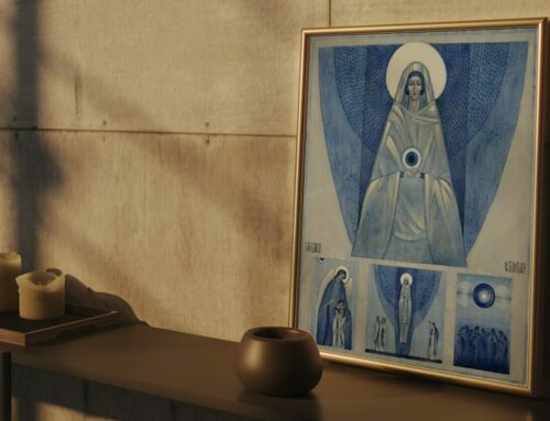
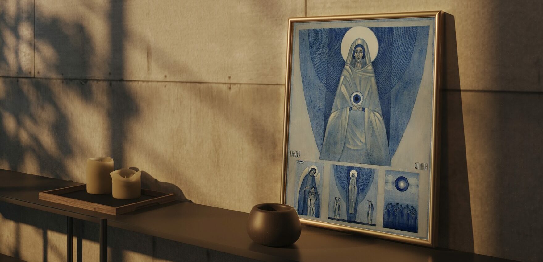
In neutral spaces – grays, whites, beiges – an icon can serve as a color accent. Warm browns, ochres, and gold will enliven a minimalist interior, introducing depth without disturbing harmony. Gold reflects light and adds warmth, especially in rooms with cool lighting.
In interiors already rich in color, it’s worth choosing an icon with a restrained palette. Too intense gilding or vivid colors can lead to visual chaos. Icons with matte backgrounds or delicate gold accents will work better.
Color temperature matters. Warm tones add coziness and energy. Cooler palettes – blues, grays in backgrounds – introduce calm and elegance.
The size of the icon should correspond to the scale of the room. In large, open spaces, an icon measuring 50×60 cm or larger will be proportional. In small rooms, a more intimate format, 30×40 cm, will work better.
It’s also worth observing how the icon changes in different light. Natural light enlivens gold and warm tones; artificial lighting can dampen or enhance them depending on the light temperature.
.
.
Traditional copy or contemporary interpretation?
The choice should arise from personal aesthetic sensibility and which visual language speaks more strongly to the recipient.
A traditional copy responds to the need for historical authenticity and connection with a specific tradition. Such an icon adheres strictly to canon, both in technique and iconography. It will work well in eclectic interiors where old and new consciously mix.
Contemporary interpretation combines symbolic depth with the language of contemporary art. The aesthetics of these icons arise from the development of iconography as a living artistic discipline, not from adaptation to trends. They preserve the theology and symbolism of tradition but express them through means of contemporary painting.

Icons in different interior styles
.
Scandinavian style
Light wood, white, pastels, and functionality define Scandinavian minimalism, which surprisingly pairs well with icons.
Icons with a cool palette work best here – white, blues, grays – or neutral, beiges, ochres, subdued browns. A particularly interesting solution is the use of white gold or silver in gilding, which subtly harmonizes with the cool aesthetics of Nordic interiors without introducing the warm accent that traditional gold provides. Such icons maintain luminosity but in a tonality closer to Scandinavian color sensibility.
It’s important that the icon be well-lit with natural light, which plays a key role in Scandinavian spaces.
.
Minimalist interior
In a minimalist space, an icon serves as a point of contemplation. Minimalism as a philosophy is based on the principle of “less, but better,” and the icon fits this idea perfectly.
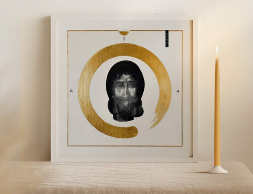
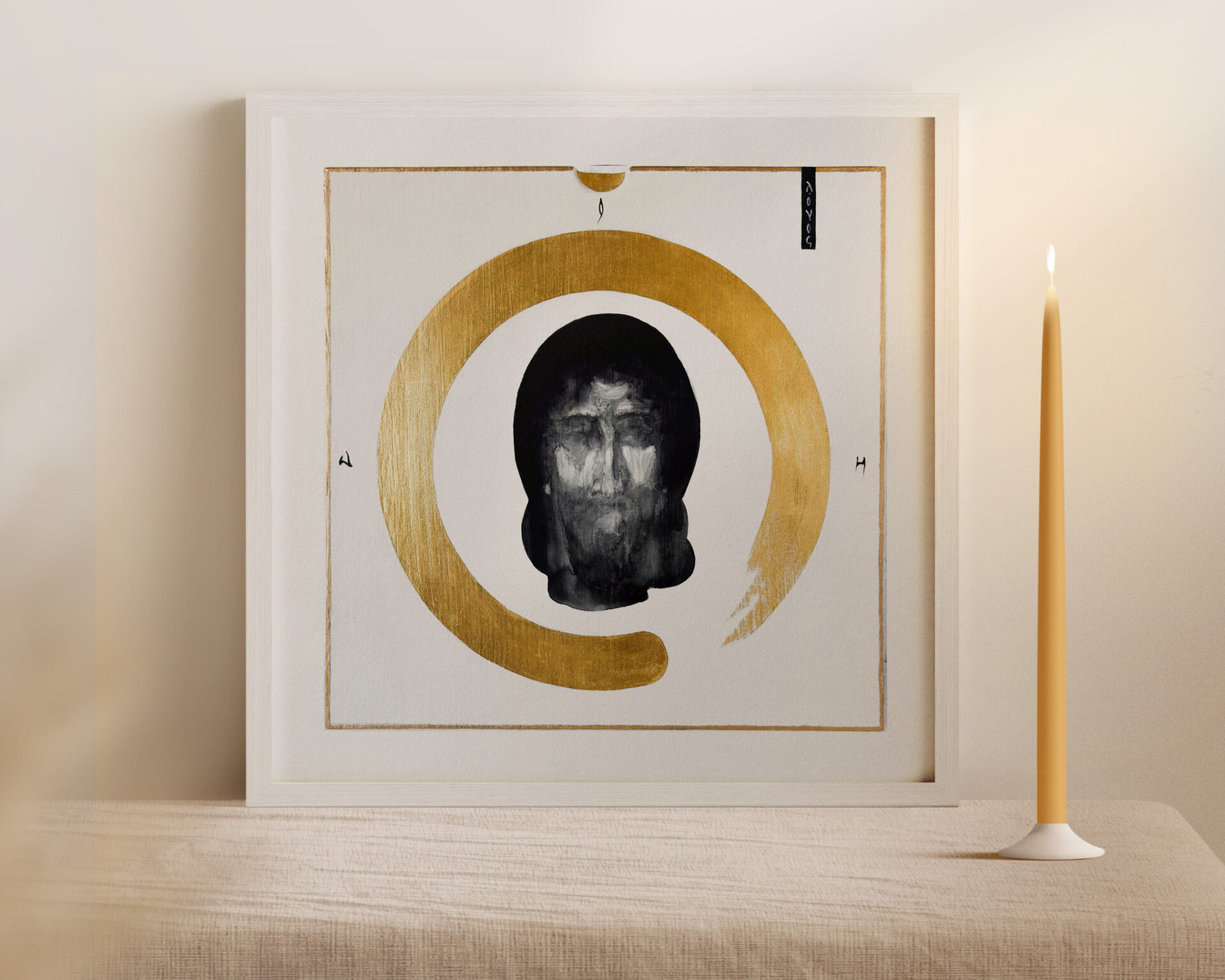
One icon as a strong visual accent works best. A work with clear, lucid form will be appropriate. A contemporary interpretation will work better than a richly decorated traditional copy, because its aesthetics are closer to minimalist assumptions.
In cool, monochromatic interiors, it’s worth considering icons with silver or white-gold backgrounds, which introduce delicate radiance without warm tonality. In spaces dominated by warm beiges and natural wood, traditional gold will work better.
The key is space around the icon. It should have plenty of free space, without an excess of details or additional decorative elements in immediate proximity.
Modern classic
Modern classic is a style balancing between the elegance of classical interiors and the purity of contemporary solutions. Noble materials – marble, brass, velvet – symmetrical composition, and restrained color palette create a timeless space where tradition meets modernity.
The icon finds its natural place here. Works combining classical iconography with a balanced color palette work particularly well. Gold in moderate proportions will be appropriate, introducing warmth without excessive ornamentation.
In interiors dominated by cool marbles and chrome details, one can consider using white gold or silver, which harmonizes with the metallic accents of furnishings. Where brass additions and warm textiles prevail, traditional gold will be a better choice.
It’s worth paying attention to icons with refined color schemes, where ochres, dark blues, and muted red harmonize with the elegant base of the interior.
Lofts and industrial spaces
Brick, concrete, metal, and large windows define industrial character, which operates through contrasts between raw background and refined details.
More expressive icons work particularly well here. A darker palette, striking gold, and larger format will be appropriate. A classical icon with rich tradition can be the right choice here, because the raw, industrial background visually withstands a certain ornamentation.
In lofts dominated by steel, raw metal constructions, and cool concrete, an interesting solution can be an icon with copper accents in gilding, which introduces a warm, slightly oxidized tone harmonizing with industrial aesthetics. Copper has a more organic, less noble character than traditional gold, which pairs well with the rawness of the space.
The contrast between the raw texture of concrete or brick and the delicacy of tempera painting emphasizes the value of both elements. The space gains depth, and the icon gains a context that doesn’t compete with its sacred dimension.
.
.
Find your icon
.
Choosing an icon for a modern interior is a matter of understanding two languages. The language of the space in which it will exist, and the language of the icon itself as an artistic form. The right combination requires reflection, but when these two languages meet, the effect can be surprisingly harmonious.
Below you’ll find my current icons ready to ship. Each is painted by hand, on wood, using the traditional egg tempera technique.
If you’re interested in a specific icon or would like to commission a work tailored to your interior, contact me. I’ll be happy to answer questions and help with the selection.


Leave A Comment